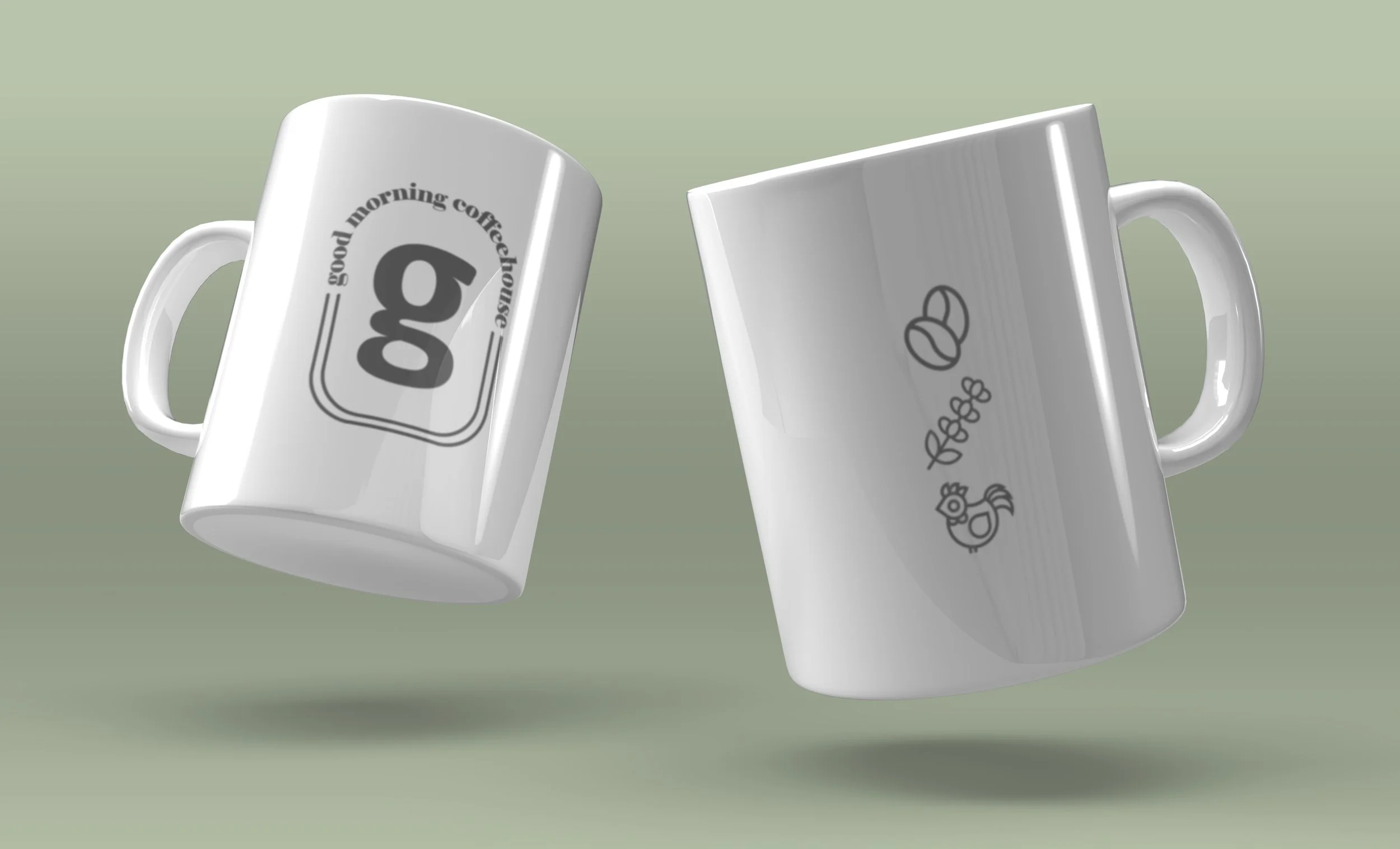
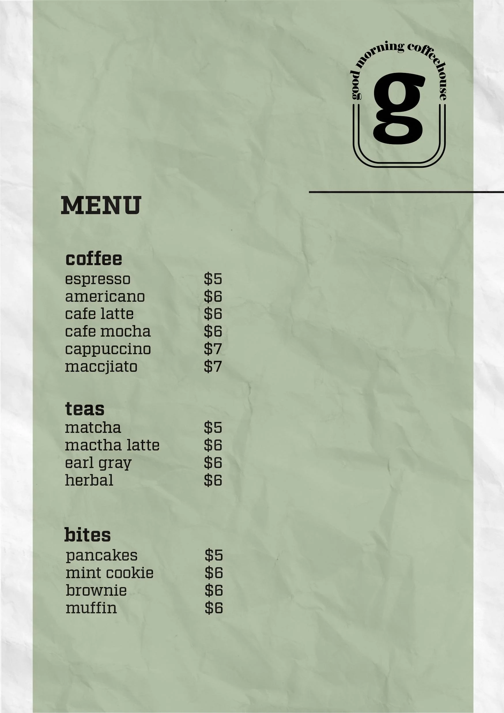
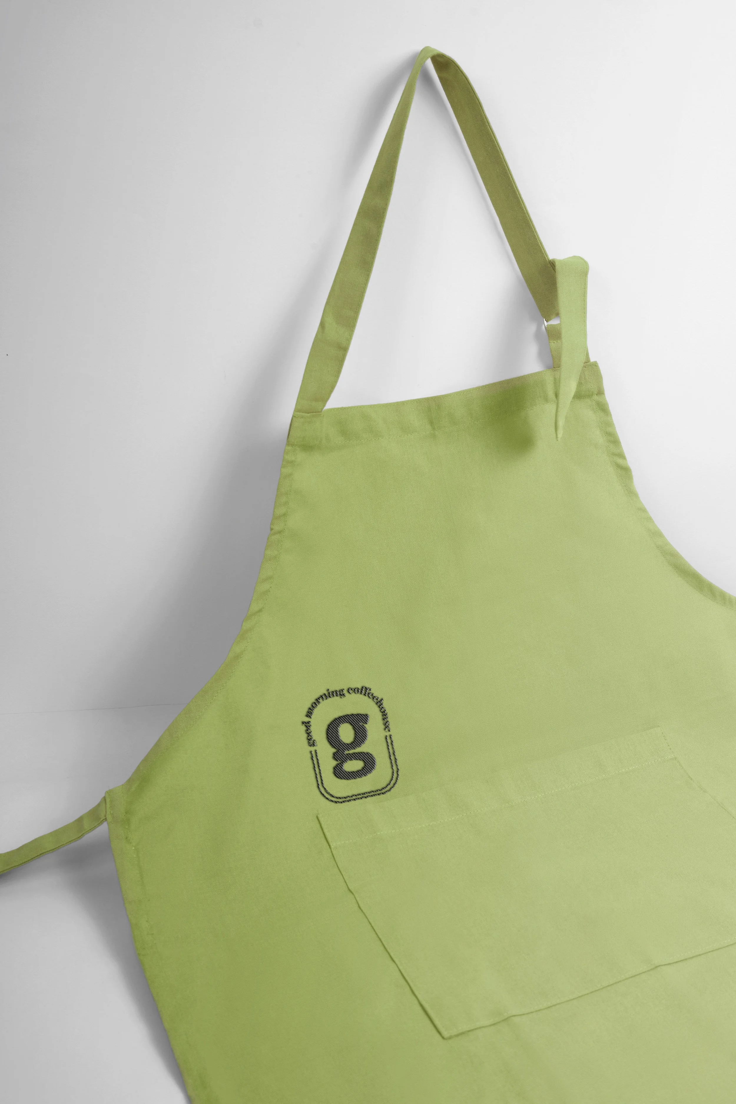
A hypothetical coffee house.
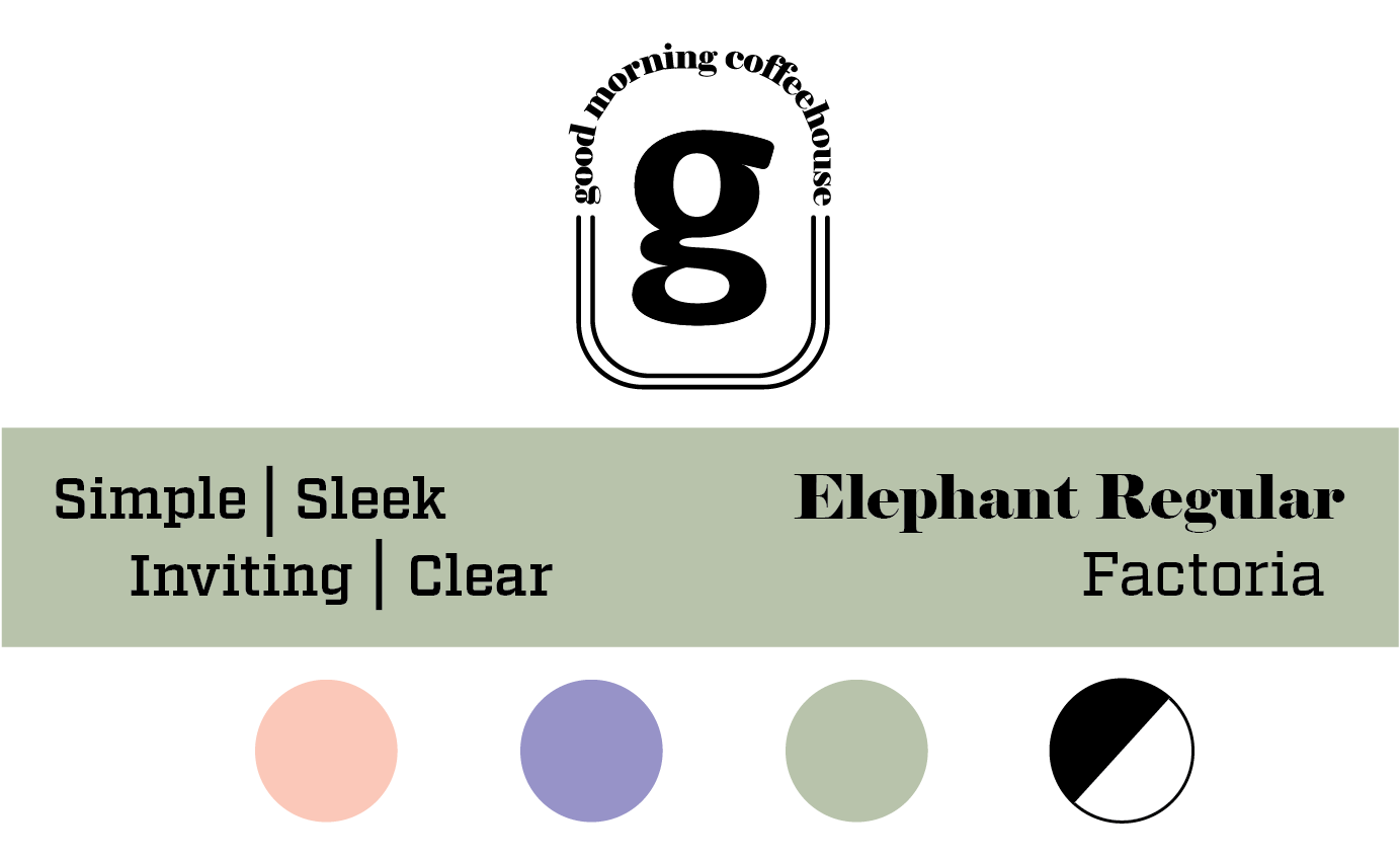
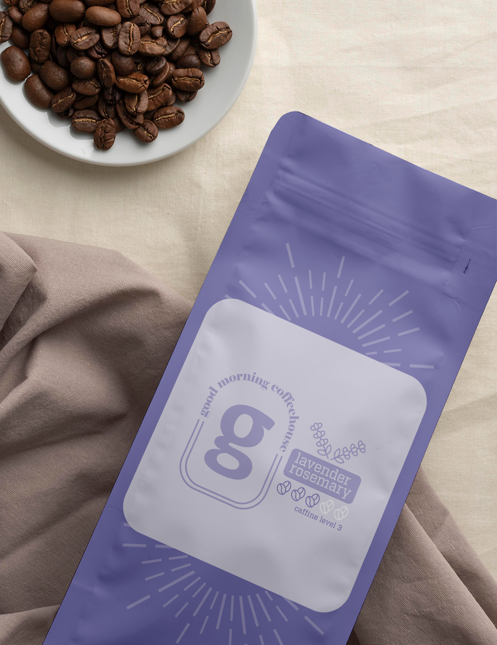
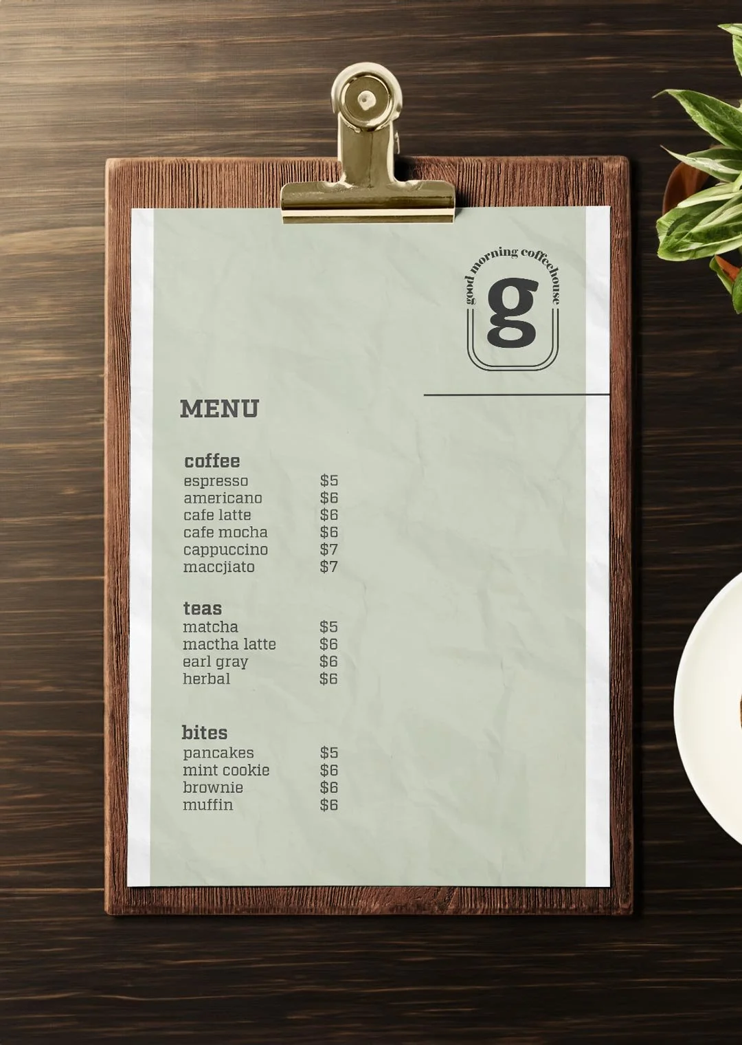
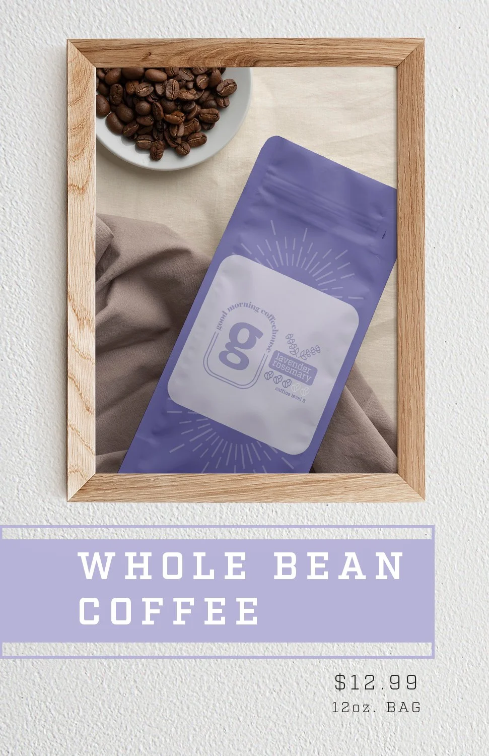
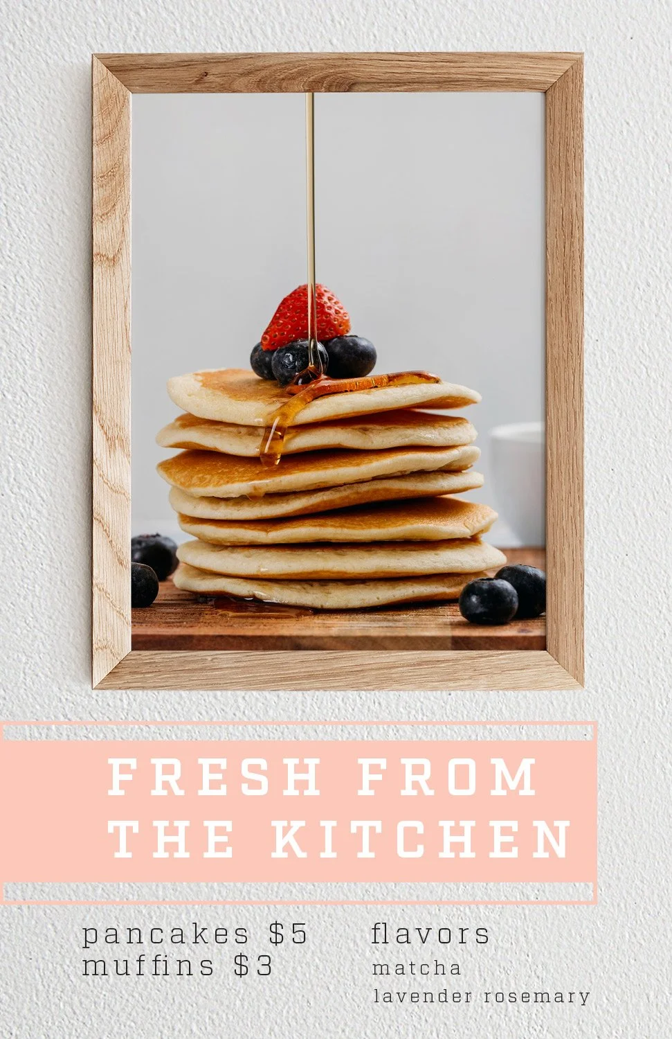
Good Morning Cafe, Chicago, IL: A minimalist haven. Simple and sleek, yet inviting. Black, white, and soft neutral tones. With the key flavors being Matcha, Lavender, and Rosemary.
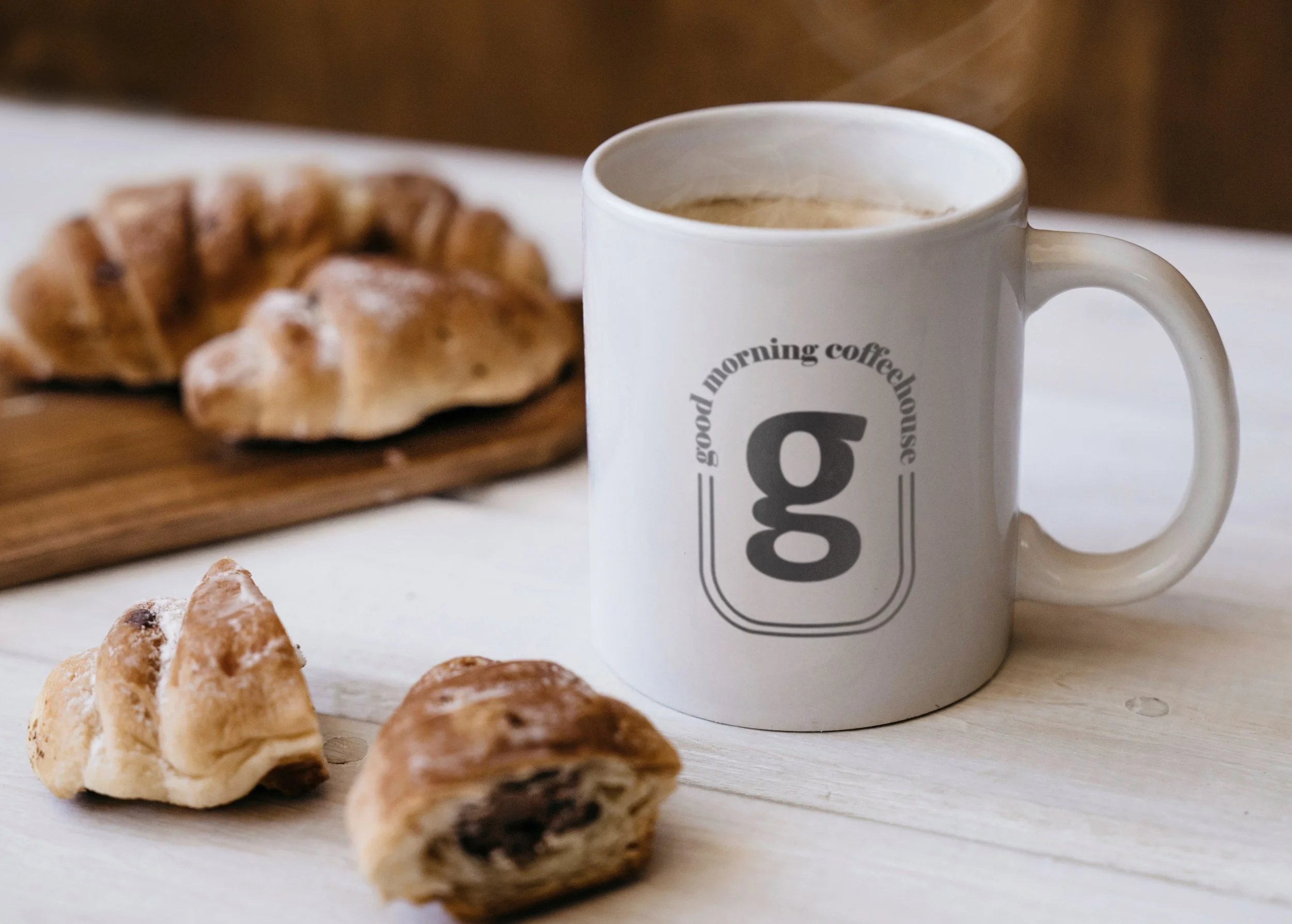
The idea behind the logo was to keep things simple and minimal. The logo is meant to invoke the shape of a coffee mug, with the large “g” inside in the place of the coffee as well as act as a symbol for business in it’s own way. The arching type on the top represents the aroma coming out of the mug.
